VERDE
A plant-forward restaurant group with image-led storytelling across every location.
A multi-location restaurant brand built around confident food photography, calm typography, and effortless reservation flow — a website that feels as considered as the menu.
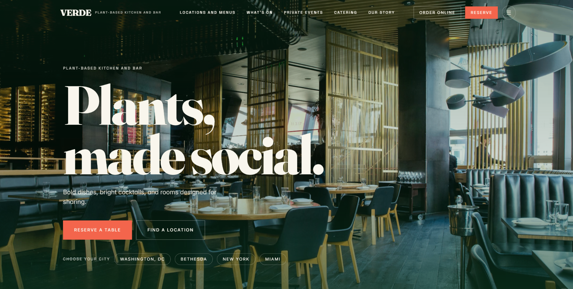
Plants, made social
An editorial hero built around a single confident statement — oversized serif type layered over a warm interior shot — reframes plant-based dining as a room you actually want to be in. Location chips at the bottom quietly move guests from ‘‘which Verde?’’ to a reservation.
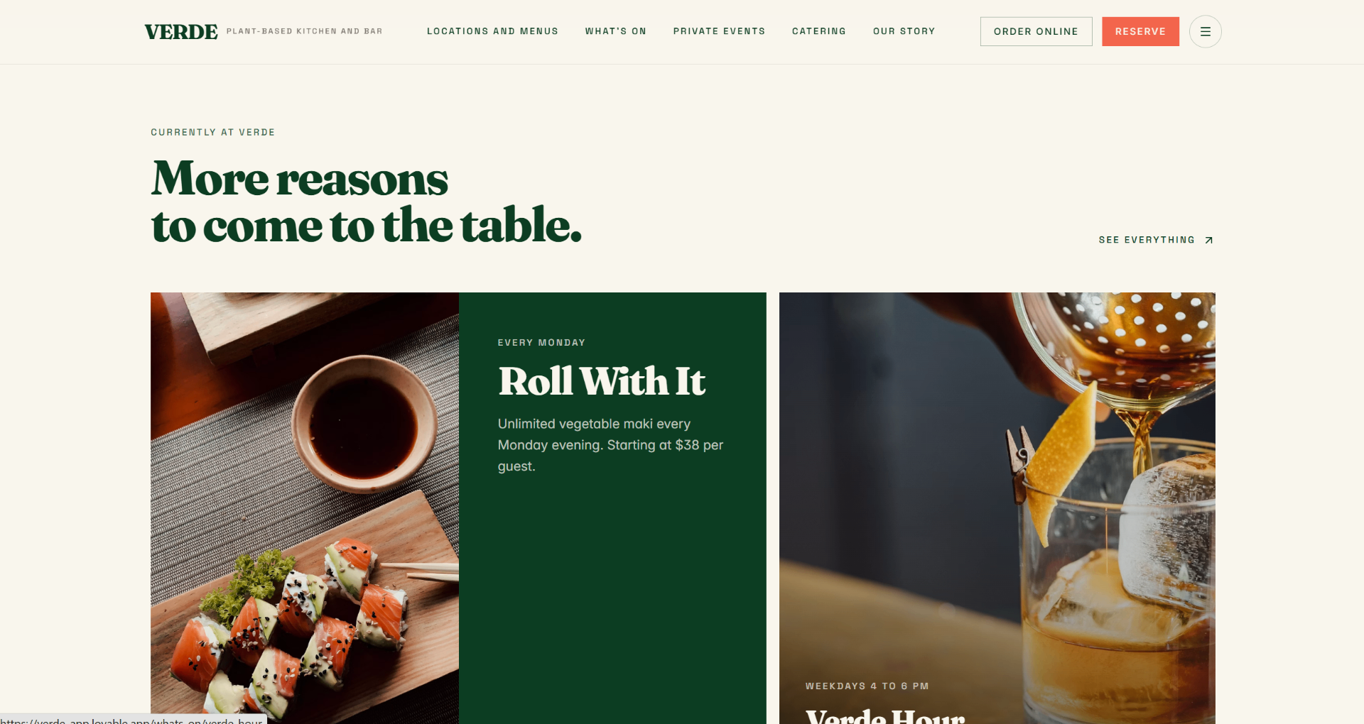
More reasons to come to the table
A rotating slate of weekly programming — Monday maki nights, weekday Verde Hour, private tasting menus — gets a magazine-style grid instead of a static events page, so regulars always have a fresh reason to book.
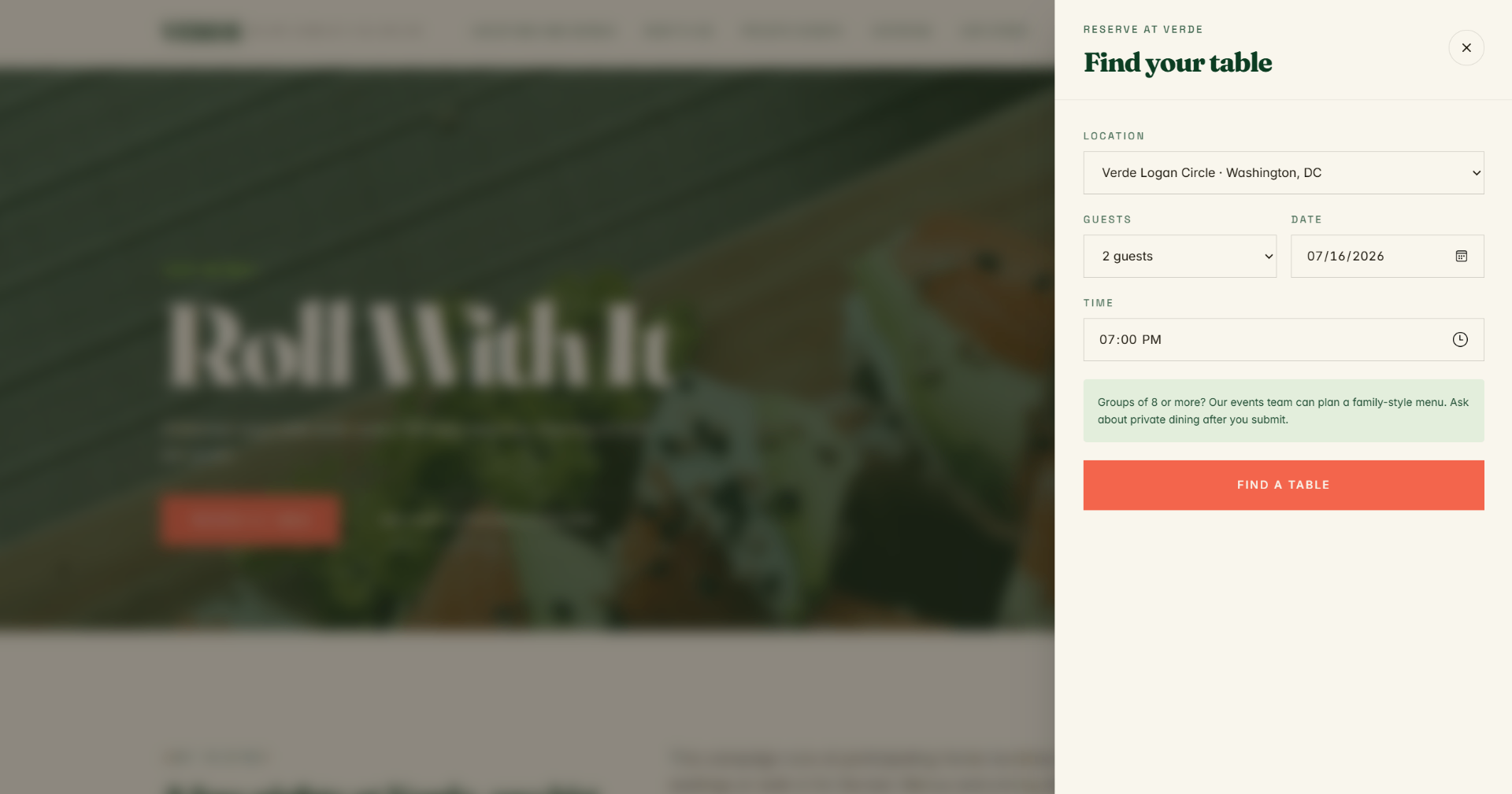
Find your table
Reserving is a right-side drawer, not a page detour. Location, party size, date and time live in one calm column, with a nudge toward private dining for groups of eight or more. Zero friction between craving and confirmation.
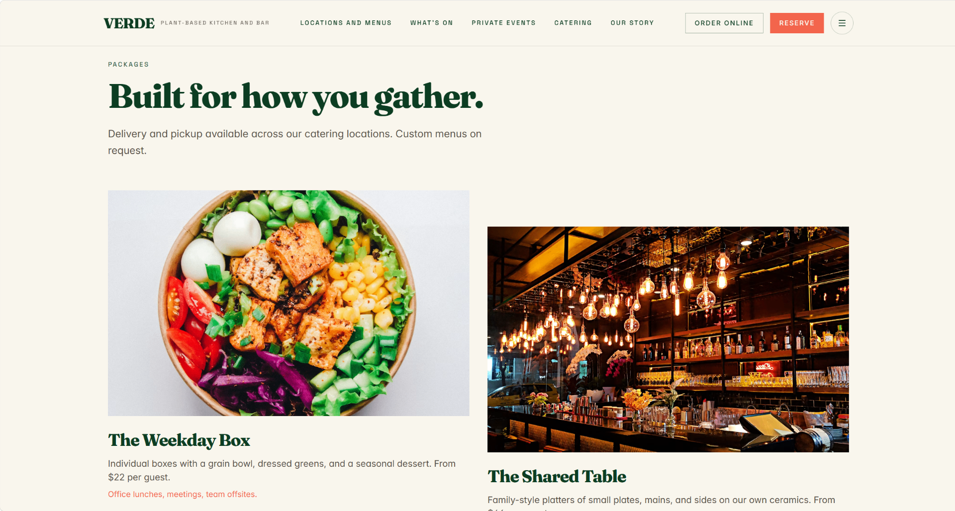
Built for how you gather
Catering earns its own storefront — Weekday Box for office lunches, Shared Table for family-style gatherings — each with photography, pricing, and a use-case tag so buyers self-select before ever emailing the events team.
The challenge
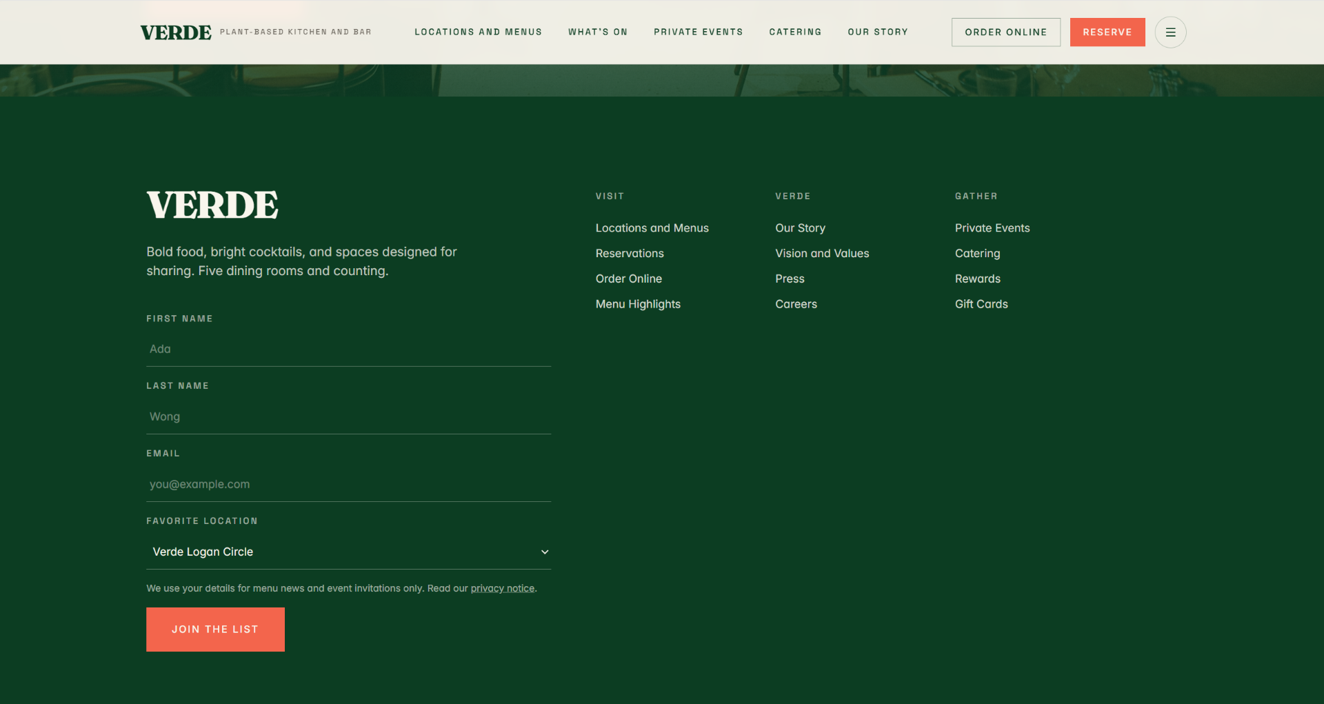
VERDE was scaling from one flagship to a small group of locations. The old site treated every venue the same, buried reservations behind three clicks, and leaned on stock imagery that undersold the food. The team needed a home that felt like a restaurant group, not a template.
Our approach
We built an image-led architecture: a shared brand story on the home page, then dedicated pages per location with their own menus, chef notes, and OpenTable-ready reservation modules. Typography was pared back to a single serif display voice; motion was kept slow and cinematic so the food carries the page.
Design objective
Reservation clicks moved from below-the-fold to the hero. Location pages give each venue its own personality without fragmenting the brand. Press and private-dining inquiries now route through a single, tracked funnel.
Scope of work
- Brand system
- Multi-location IA
- Reservation flow
- Photography direction
- Private events funnel
Disclosure
This is a Reachtive concept project. It is an independent work created to demonstrate our strategy, design, and development capabilities. It is not affiliated with, endorsed by, or created for any real company, and any names, contact details, or imagery are fictional or for demonstration purposes only.
Related work
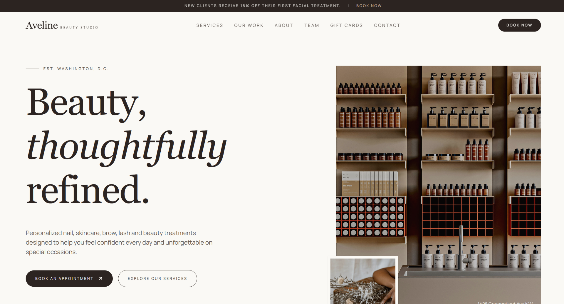
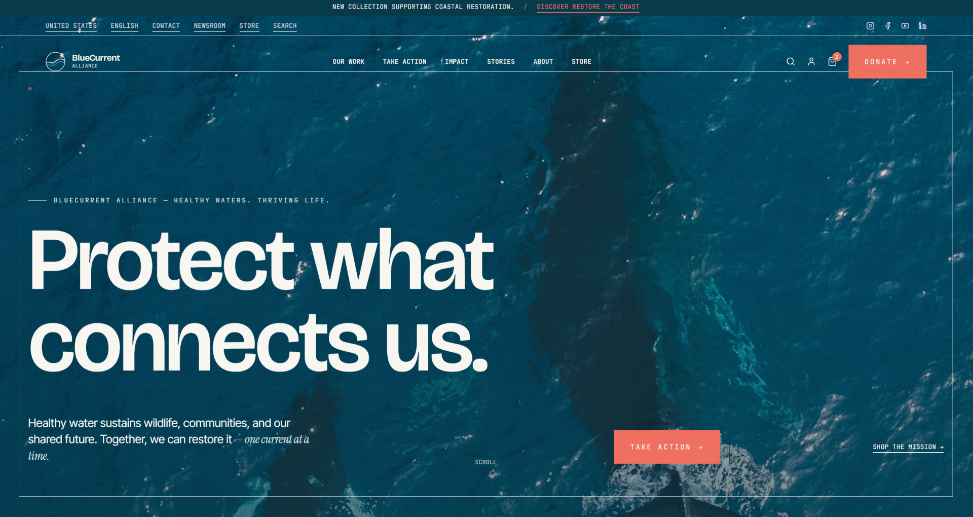
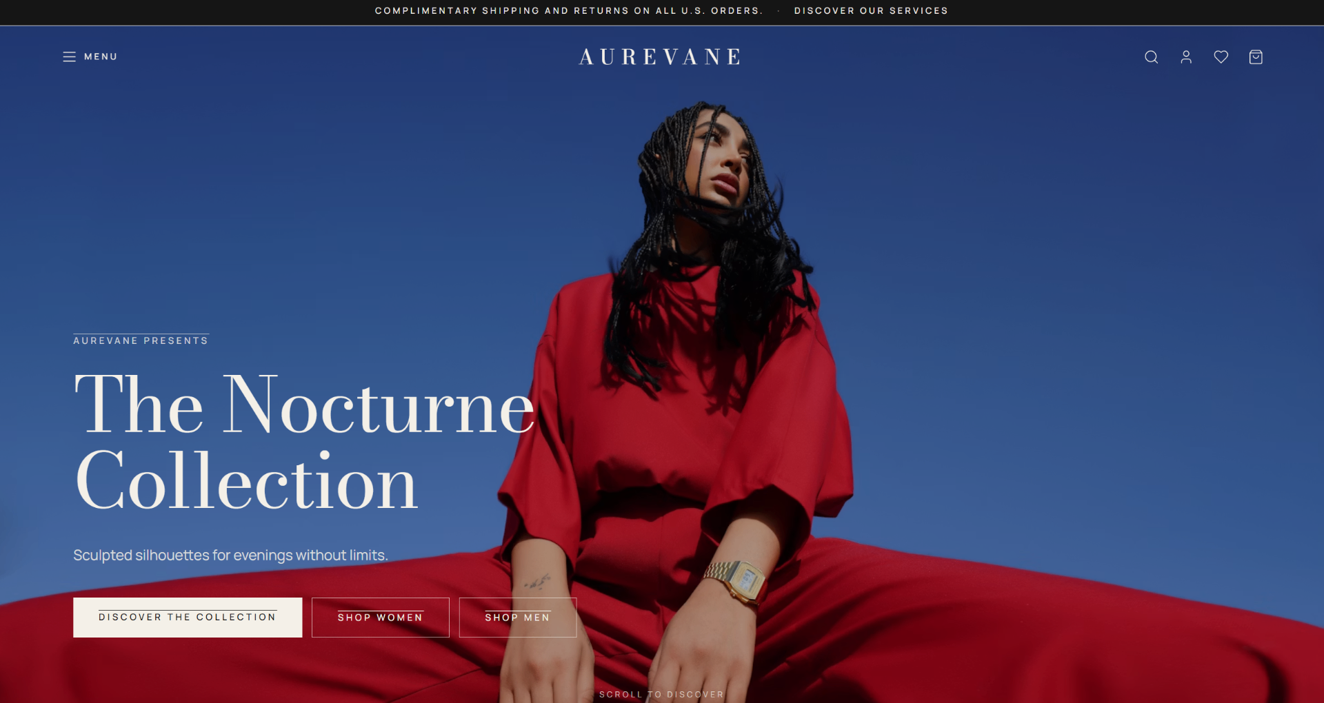
More concept projects.
Next step